Branding
2025-2026
Assembly Student Living
I designed a full brand identity for a student housing complex, building out a color palette and guidelines rooted in the building's history as a renowned 1960s hotel.
Overview
The student housing complex had only a logo to work with. They did not have a color palette, a broader visual identity, or any guidelines to keep the brand consistent across materials. Its marketing also needed to speak to two audiences with very different needs at once: prospective student residents, and the parents helping them make the decision, often for the first time sending their child away from home.
Process
Starting from the existing logo, I built out a color palette drawn from the building's own history. In the 1960s, the building was s a renowned former nightclub hotel called The Regency Hotel. Today, the interior still carries a retro, vintage character. I used that as the foundation to build out a full set of brand guidelines. From there, I applied the identity across several pieces: online marketing (social content, digital ads, and print materials like flyers and brochures) that wove student-facing energy and parent-facing reassurance into the same materials rather than running separate campaigns. In addition, I designed an extensive welcome packet for new residents incorporating the guidelines and hand-drawn assets; and a signage set for the front desk so residents would have clear information even when an RA wasn't available.

Color palette and type pairings created for the Assembly Student Living Brand.

Illustrated assets designed to be applied to physical collateral.
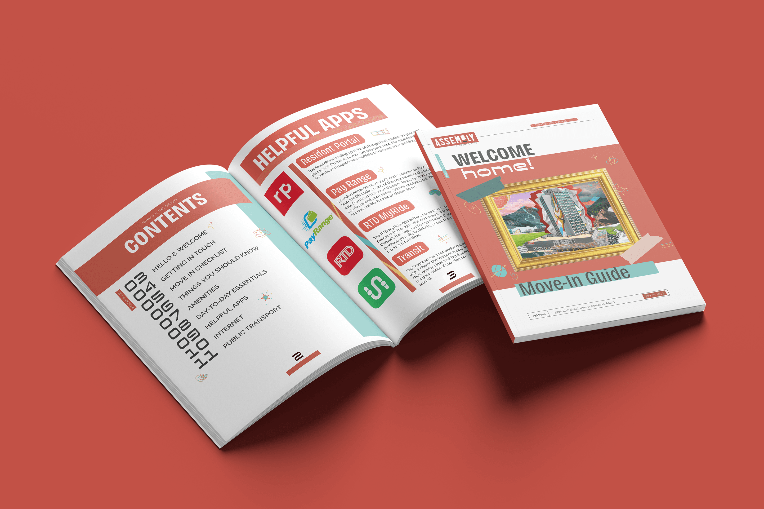
New resident welcome packet.

A cohesive signage set for the front desk, extending the brand guidelines into everyday wayfinding and information for residents
Outcome
What began as a single logo became a full visual identity grounded in the building's history, applied consistently from marketing to print to wayfinding. Featured pieces include the logo, color palette, and guidelines, the welcome packet, front desk signage, and sample social and print collateral.
Reflection
This project pushed me to think about branding as more than a visual system. It was about building something that could hold two very different audiences at once without feeling split in two. Starting from just a logo forced me to be intentional about every decision that followed, especially the color palette, where I leaned into the building's history rather than defaulting to something generic or trend-driven. That choice ended up shaping the tone of everything else, from the welcome packet to the signage.
Designing for parents and students simultaneously was the biggest challenge and the most valuable lesson. It taught me that good design doesn't always mean creating separate messages for separate audiences, sometimes it means finding language and visuals flexible enough to mean something different to each viewer while still feeling like one coherent brand. It's a skill I now look for in every branding project I take on: how to build something that flexes without fracturing.
